Introduction
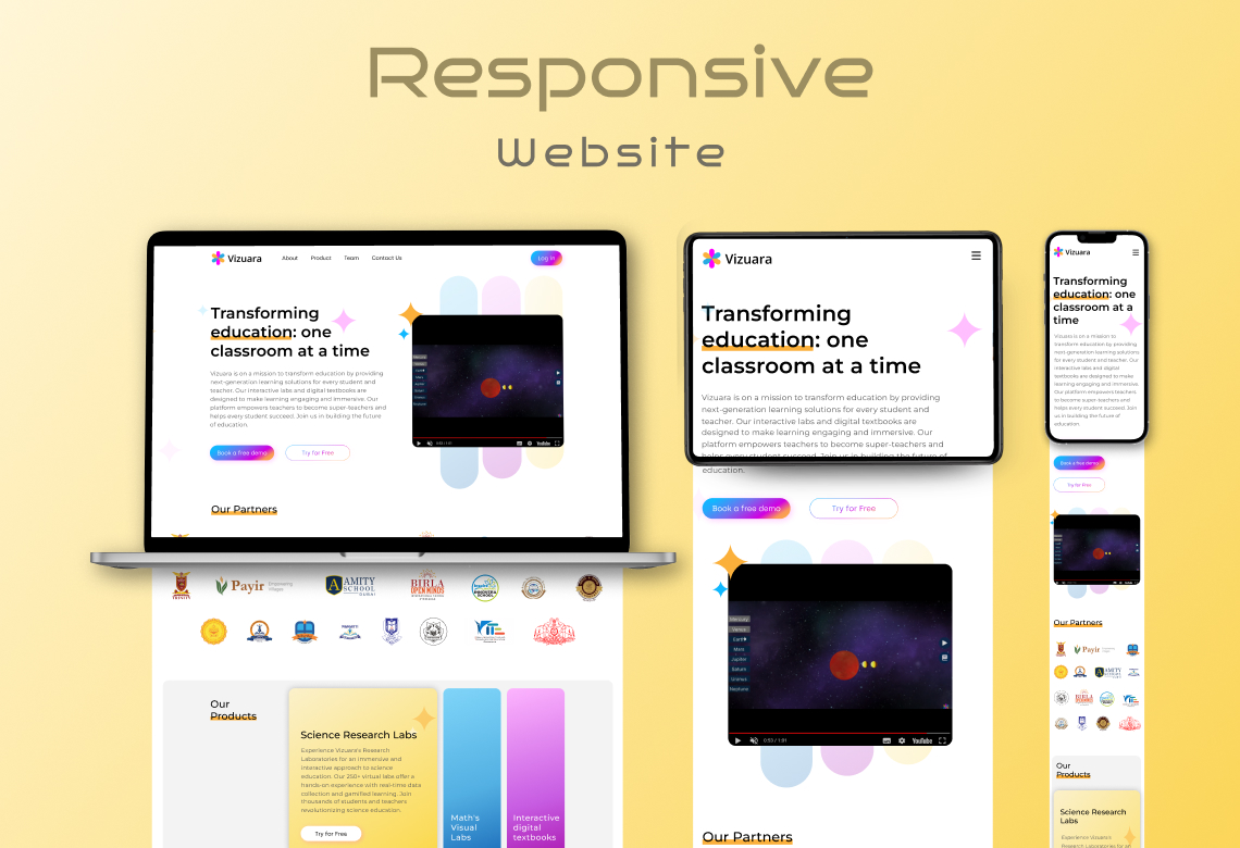
Vizuara, an innovative online education platform, aimed to redefine digital learning by offering interactive classes to learners across the globe. Understanding that a compelling and intuitive user interface (UI) and user experience (UX) were central to realizing their vision, Vizuara adopted a user-centric approach to their design process. This case study explores the design challenges encountered, the process undertaken, and the outcomes of Vizuara’s UI/UX design journey.
Pre-Design Scenario
Vizuara recognized that despite the surging number of online education platforms, there was a gap in the market for a truly interactive, engaging virtual classroom experience. Their ambition was to create a platform that would not only replicate the physical classroom experience but also enhance it, providing unique ways for students and teachers to interact and learn.
Design Process
The UI/UX design journey was divided into four stages:
User Research: To comprehend the needs and preferences of both students and teachers, the design team conducted comprehensive user research, including interviews, surveys, and competitive analysis.
Wireframing and Prototyping: Leveraging the insights from the research phase, they drafted wireframes for each screen, followed by interactive prototypes. These early models served as the blueprint for the final design.
UI Design and Interaction: The team created the visual design elements, including color schemes, typography, and icons, ensuring consistency across the platform. They also focused on designing interactive elements to make the online learning experience more engaging.
Testing & Iteration: The designs were then user-tested for usability and intuitiveness. Based on the feedback, the team made necessary iterations until they achieved a seamless, user-friendly design.
Challenges and Solutions
During the design process, the team faced several challenges:
Creating an Interactive Experience: Designing a platform that is as interactive and engaging as a physical classroom was a challenge. The team addressed this by designing features such as a real-time digital whiteboard, interactive quizzes, breakout rooms, and more.
Simplifying Complexity: With a range of features to offer, maintaining simplicity and intuitiveness was challenging. The designers tackled this by employing a minimalist design approach, using clear navigation, and organizing the platform into easily understandable sections.
Results and Benefits
Post-launch, Vizuara saw numerous benefits:
User Engagement: The interactive classes and user-friendly design led to high engagement rates among students and teachers.
Positive User Feedback: Users praised the platform’s ease of use, interactive features, and intuitive design, leading to positive reviews and high user satisfaction scores.
Increased User Base: Thanks to its innovative approach to online learning, Vizuara experienced a rapid increase in new users.
Conclusion
Vizuara’s successful UI/UX design journey underscores the importance of a user-centric approach in creating an effective and engaging online learning platform. This case study shows how understanding user needs, followed by thoughtful design and rigorous testing, can result in a platform that not only meets but exceeds user expectations. It stands as a testament to the power of good design in transforming the digital learning experience.
